Style Guide
Reference copy
This page documents the key specifications from the Trove Brand Guidelines. For visual examples, logo files, and full-resolution assets, refer to the original Brand Guidelines PDF and the Media Resources page.
1. The Brand
Mission
To make corporate gifting easy, scalable, and brand-owned through smart, intuitive technology.
Vision
To be the trusted platform brands use to power gifting at scale - simply and seamlessly.
Brand Values
| Value | Description |
|---|---|
| Simplicity | We remove complexity to make gifting feel effortless. |
| Thoughtfulness | Every detail is designed with care and intention. |
| Empowerment | We give brands the tools to own and scale their gifting. |
| Reliability | Our platform is dependable, consistent, and always on. |
Brand Archetype
The Creator - We are driven by a desire to build things that last - to create systems, designs, and tools that empower others to create as well. We value imagination, craft, and expression. We take pride in the details, and we believe that good things take time. Like all creators, we strive for originality, not imitation. Trove isn’t a plug-and-play solution. It’s a carefully considered toolkit - designed to help brands build gifting experiences that are uniquely theirs.
Key Attributes
- Intentional
- Refined
- Approachable
- Empowering
- Scalable
2. Verbal Identity
Tone of Voice
Trove's tone is intentional, expressive, and human. We write the way we speak - with clarity, warmth, and a focus on action. Our tone adapts to the context, but always reflects who we are: thoughtful, empowering, and confident in our craft. We don’t use jargon or overcomplicate. We believe in saying meaningful things, simply. Our words should make people feel something - and invite them to explore what’s possible with Trove.
Writing Characteristics
| Characteristic | What It Means |
|---|---|
| Simple | Clarity is at the heart of everything we write. We cut through complexity with straightforward, jargon-free language that’s easy to read and even easier to act on. |
| Expressive | Our tone is energetic and alive. We use language that paints a picture and brings our ideas to life, making even the simplest message feel meaningful and distinctive. |
| Intentional | We believe that every word counts. Our writing is purposeful and precise, crafted to communicate clearly and efficiently without unnecessary filler or decoration. |
| Empathetic | We write for real people. That means meeting our audience where they are, anticipating their needs, and using language that’s thoughtful, respectful, and inclusive. |
Do's and Don'ts
Do:
- Use bold, intentional language that sparks curiosity
- Use specific words that bring ideas to life
- Use a tone that feels human, warm, and real
Don't:
- Use generic phrases that say nothing new
- Use overly polished or robotic language
- Use jargon that clouds the message
3. Visual Identity
Design Principles
Trove’s brand is built on four core principles that guide every design decision. These principles give us room to be expressive while maintaining a unified, elevated identity
| Principle | Description |
|---|---|
| Minimal | We remove the unnecessary, letting simplicity and whitespace elevate what matters. Our designs are focused, clean, and efficient, allowing the core message to shine. |
| Refined | Every element is considered and crafted. We pay close attention to detail, balance, and proportion to create visuals that feel polished and timeless. |
| Playful | While structured, our brand carries a lightness. We use colour, movement, and moments of charm to create experiences that feel personal and engaging. |
| Symbolic | We incorporate elements that hold deeper meaning. From keys to treasure chests, our visuals connect back to our brand story - gifting as discovery, intention, and delight. |
4. Logo
Variants
| Variant | Usage |
|---|---|
| Primary | Full wordmark - preferred for most applications |
| Secondary | Wordmark with tagline or alternative lockup |
| Brandmark | Icon only - used at small sizes or where the full wordmark is impractical |
On Colour
The logo is available in:
- Deep Purple - on light backgrounds (cream, white)
- Cream / White - on dark or coloured backgrounds (Deep Purple, Olympic Blue)
Clearspace
Maintain a minimum clearspace equal to 1× the height of the "T" in the Trove wordmark on all sides. No other elements should enter this zone.
Scale
| Medium | Minimum Size |
|---|---|
| Digital | 20px height |
| 10mm height |
Things to Avoid
- Do not stretch or distort the logo
- Do not rotate the logo
- Do not use unapproved colour combinations
- Do not apply drop shadows or effects
- Do not place the logo on a busy or low-contrast background
- Do not recreate or modify the logo in any way
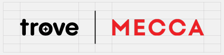
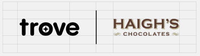
Partnerships & Co-branding
When using the Trove logo alongside a partner logo, maintain equal visual weight and ensure adequate separation between marks. Always use the approved lockup files where available.
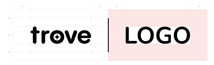
Examples:
5. Colour
Primary Palette
| Swatch | Name | Hex | Usage |
|---|---|---|---|
| Deep Purple | #270935 |
Primary brand colour. Backgrounds, headings, dominant UI elements. | |
| Olympic Blue | #2094FB |
Action colour. CTAs, links, highlights. | |
| Cream | #FFEFD1 |
Warm neutral. Backgrounds, contrast against deep purple. |
Secondary Palette
| Swatch | Name | Hex | Usage |
|---|---|---|---|
| Orange | #FF5400 |
Accent. Use sparingly for energy and emphasis. | |
| Yellow | #FFBD00 |
Accent. Warm highlight. | |
| Deep Magenta | #9E0059 |
Accent. Bold contrast. | |
| Blue Violet | #390099 |
Accent. Sits between purple and blue. |
Colour Hierarchy
- Deep Purple is the dominant brand colour - it should anchor compositions
- Olympic Blue drives action and interaction
- Cream provides warmth and contrast
- Secondary colours are accents - they should not compete with the primary palette
Things to Avoid
- Do not use unapproved colours in brand communications
- Do not use low-contrast colour combinations
- Do not use the secondary palette as dominant colours
- Do not place Deep Purple text on Olympic Blue backgrounds (contrast risk)
6. Typography
Primary Typeface
Pangram Sans Rounded Bold
Used for: logos, hero titles, and large display type where the brand needs maximum presence.
Note: This is a licensed typeface. Do not use for body copy or UI text.
Secondary Typeface
Nunito - used for all other text across brand and product.
| Weight | Style | Use Case |
|---|---|---|
| Regular 400 | Normal | Body copy, descriptions |
| Italic 400 | Italic | Emphasis, pull quotes |
| Semibold 600 | Normal | Subheadings, labels |
| Bold 700 | Normal | Section headings, callouts |
| Extrabold 800 | Normal | Hero text, large headings |
Type Hierarchy
| Level | Typeface | Weight | Recommended Size |
|---|---|---|---|
| Display / Hero | Pangram Sans Rounded | Bold | 64px+ |
| H1 | Nunito | Extrabold 800 | 48px |
| H2 | Nunito | Bold 700 | 36px |
| H3 | Nunito | Semibold 600 | 24px |
| Body | Nunito | Regular 400 | 16px |
| Caption / Label | Nunito | Semibold 600 | 12–14px |
Colour Use
- Deep Purple - primary text colour on light backgrounds
- Cream or White - text on dark or coloured backgrounds
- Olympic Blue - links and interactive text
- Avoid placing coloured text on competing colour backgrounds
Highlighting
When highlighting text for emphasis within body copy, use the brand accent colours (Yellow or Cream) as background highlights. Avoid using bold for entire sentences - reserve it for key terms only.
7. Design
Pattern
The Trove pattern is derived from the brandmark and used as a supporting graphic element - not as a dominant background. It should be used at reduced opacity or cropped partially into frame.
Pattern Colour Usage:
- Deep Purple pattern on Cream background
- Cream or white pattern on Deep Purple background
- Do not use the pattern in secondary accent colours
Brandmark 3D Elements
Three-dimensional versions of the Trove brandmark are available for use in premium placements such as hero imagery, event materials, and product mockups. These are pre-rendered assets - do not attempt to recreate or modify them.
Grid Specifications
| Format | Dimensions | Margin | Gutter | POI Safe Area |
|---|---|---|---|---|
| Portrait (4:5) | 1080 × 1350px | 80px | 24px | 40px |
| Landscape (16:9) | 1920 × 1080px | 80px | 24px | 40px |
| Square (1:1) | 1080 × 1080px | 80px | 24px | 40px |
POI Safe Area - keep all key content (text, logos, faces) within 40px of the safe area boundary to ensure correct cropping across platforms.
Photography Guidelines
- Use photography that feels real, warm, and considered - not stock-photo generic
- Subjects should reflect the brand's audience: professionals, brands, corporate teams
- Avoid overly posed or artificial-looking imagery
- Prefer natural light and warm tones that complement the cream and purple palette
- Product photography should be clean and minimal with consistent backgrounds
8. Application
Social Media
- Use approved grid templates for feed posts
- Maintain consistent colour and typography across all social channels
- The brandmark may be used as a profile icon at small sizes
- Stories and Reels should follow the Portrait (4:5 or 9:16) grid spec
Advertising
- Always include the logo in approved colour combinations
- CTAs should use Olympic Blue as the action colour
- Headlines should use Pangram Sans Rounded Bold where possible
- Ensure sufficient contrast for accessibility (WCAG AA minimum)
Events
- Use Deep Purple as the primary event colour
- The 3D brandmark assets are preferred for large-format print
- Event collateral should feel premium and minimal - avoid clutter
Merchandise & Print
- Use print-safe colour values (consult the brand team for CMYK equivalents)
- Embroidery and debossing should use the brandmark only at approved minimum sizes
- All printed materials must be approved before going to production
Motion
- Animations should feel smooth and intentional - avoid fast or jarring transitions
- Brand transitions use Deep Purple and Cream as primary motion colours
- The brandmark animation is a pre-built asset - use it as provided; do not modify